The Enduring Appeal of Pastels
In recent years, through the changing seasons and trends, one colour palette has continued to feature. Though the use, style and specific shades may evolve each time they reappear, pastels have been a key element in the design world.
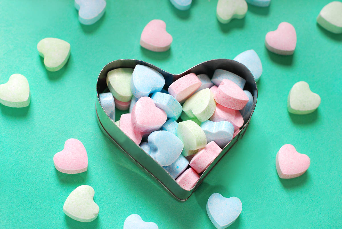
The 1980s is probably the time we most associate with these soft, bright colours – from Miami Vice to John Hughes movies, they were seemingly everywhere – but they recur throughout the decades, coming round in cycles, as many trends do. They are certainly reminiscent of hazy ice cream daydreams and sweetshops from our childhoods. But that doesn’t mean they can’t be sophisticated.
In fashion, they used to appear mostly in the spring/summer seasons, but in the last few years, their versatility has been shown more and more, with candy-Esque shades being used to brighten up the dark depths of winter. Whether making preppy styles pop or adding a soft edge to sportswear, they show up in many areas of clothing, going far beyond florally sun-dresses (though don’t get me wrong, these generally look gorgeous too).
For interiors, though they may have previously been used almost exclusively in children’s rooms and nurseries (due to their playful nature), they have also been known to crop up in other areas – pastel bathroom suites were once the height of fashion. But they are increasingly being used in living rooms, dining rooms and bedrooms, which can all look great with pastels. To get the best out of them, use them as accent colours rather than saturating an entire room in one shade, thereby avoiding the sense that the Easter Bunny was in charge of the redecorating.
This spring/summer season they have had a distinct ‘en plein air’ feel, with very soft colours inspired by the natural world, as shown below with our Alice modular sofa and Enzo Swivel chair, rather than the brighter candy-crush tones (though they still have their place, with smaller home accessories creating emphasis).
But why such a long-standing fascination with this particular set of hues? To get a bit technical for a moment, pastel shades are characterised by having a low saturation and high value in the HSV colour space. This means that there are countless shades and tones, many of which combine brilliantly with other similar or contrasting colours. This makes them incredibly adaptable and timeless in their appeal.
It would seem that we will continue to see baby pinks, sky blues and mint greens in our homes, clothing and even web design for aeons to come. So feel free to give in to your inner nostalgia and add a touch of retro charm to your home. Remember, pastels aren’t so much an old-fashioned throwback as they are eternally elegant.
Post written by Julie Fisher


