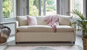
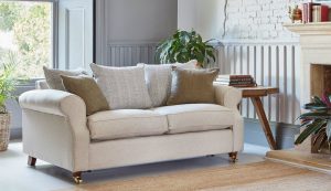
Decorating with a Cream Leather Sofa
Decorating with a neutral colour like cream can seem easy, but it’s still important to take care and select colours, fabrics and accessories carefully to achieve a coherent scheme. This is particularly the case with a cream sofa, even a larger 3-seater sofa to avoid it being completely overwhelmed by brighter colours surrounding it.

Cream leather sofas are a design classic, without the brash modernity of pure white leather, but still cool, elegant and neutral. It could be a soft aniline leather which will gradually develop an attractive patina over years of use, or a more robust semi-aniline or stain-resistant leather that is ideal for heavy use and placement in family homes. Choosing the right kind of leather, and particularly considering the uses the sofa will be put to and the chance of damage, is especially important with light colours like cream, that can otherwise show up damage and wear quickly.
Neutral Colour Palette
Probably the most obvious way to decorate with a cream leather sofa is as part of a neutral colour palette. The cream is a perfect base for a neutral palette, being a little warmer and more welcoming than white. You can extend and vary the scheme to walls, curtains, soft furnishings and other accessories by varying the shade of cream as well as introducing light browns, truffle, and even a bit of bronze.

Grey and Cream Leather Sofas
Another great way to vary a muted colour scheme based around a cream sofa is with grey. Place light greys elsewhere in the room such as curtains, rugs or even other furniture, and veer towards darker greys directly on top of the cream for scatter cushions or throws.
It’s worth bearing in mind, however, that not all greys go with cream. A cooler more ‘crisp’ grey won’t necessarily go with a softer, warmer cream. So take some time to look at swatches and samples, place things side-by-side, and think about the overall effect and visual ‘temperature’ you are trying to achieve.
Bold accent colours with cream
A cream leather sofa can be a great backdrop for a strong accent colour. The direct complementary colour from a colour wheel is lavender or pale purple, and generally, complementary hues work well together, especially for a bold accent colour. That said, a cream and lavender scheme can look very washed-out and very feminine in a way that isn’t to everyone’s tastes. For a bolder accent colour consider dark slate navy blue, or dark green. Both colours work well with the natural subtle yellow of cream and will create a more varied and gender-neutral feel.


